
Those Tfl fare rises in handy chart form
Mike Pollitt | Wednesday 9 November, 2011 10:35
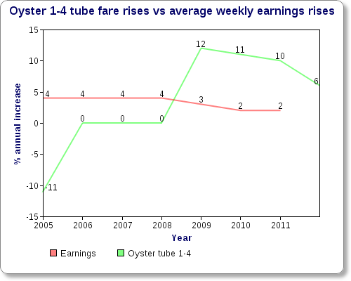
Yesterday Londonist performed a valuable service and dug out the last decade’s worth of Tfl fares so we could see how much the bastards have raised them. To Londonist’s data, we can now add some context in the shape of this sexy graph, which plots the average annual increase in a peak time Oyster card journey from zones 1-4 against the average annual increase in weekly earnings.
What does it show? What we already knew, that in the last few years fare rises have outstripped earnings rises. Considerably. Result: low and medium earners spending more money on getting places, and having less money to spend on doing stuff and buying things.
Sources: Fare data from Tfl via Londonist.
Average weekly earnings from the ONS. I’ve used the regular pay index. I’m not a statistician, so if anyone can educate me as to a better measure to use I will be all ears.
Snipe Highlights
Some popular articles from past years
- An interview with Desiree Akhavan
- 9 poems about London: one for each of your moods
- Nice map of London's fruit trees shows you where to pick free food
- Number of people using Thames cable car plunges
- Nice Interactive timeline lets you follow Londoners' historic fight against racism
- Punk brewery just as sexist and homophobic as the industry they rail against
- Random Interview: Eileen Conn, co-ordinator of Peckham Vision
- Summer Camp: Roll out those lazy, hazy, crazy days
- The five spookiest abandoned London hospitals
- Silencing the Brick Lane curry touts could be fatal for the city's self-esteem
© 2009-2026 Snipe London.