
The Trainspotting Posters: Fifteen Years Later
Chuck Ansbacher | Wednesday 9 March, 2011 11:07
Can you believe it’s already been fifteen years since Trainspotting launched the careers of all its stars and its director and entered the cultural lexicon as one of the most iconic films of the 1990s? If you answered yes, sorry… you’re old.
It’s safe to say that without the marketing materials everyone associates with it, Trainspotting would not have become the international hit that it did. They, more than any line of dialogue or any scene in the movie, are the first thing that pops into most peoples’ heads when “Perfect Day” pops on at the pub.
Over at Creative Review, Mark Blamire and Rob O’Connor talk about what went into their creative process, how they settled on Helvetica, the color orange, and a bunch of details you probably took for granted until now:
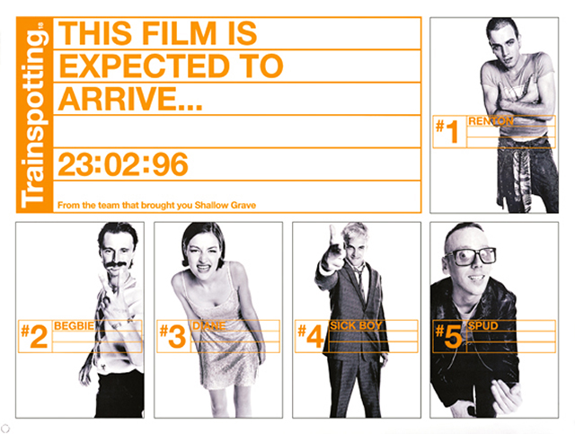
Creative Review: The posters for Trainspotting were so unusual when they came out especially the campaign around the characters with one poster introducing each one (I realise there were larger posters with all of them on too). What was your inspiration for this? How did the campaign come about?
Rob O’Connor: Irving Welsh’s novel, from which the movie had been adapted, was written from the multiple points of view and in the voices of each of the main characters, and we felt it was important to stress the individuality of those personalities. Only Ewan MacGregor and Robert Carlyle were reasonably well known at this time, so it was quite unusual to take this approach. The characters in the story themselves almost seemed more important than the actors playing the roles.
Mark Blamire: I can remember a few years earlier seeing the individual character posters for the film Reservoir Dogs, designed by Mia Matson at Creative Partnership. It was a really impactful poster campaign at the time. I kind of used this as my challenge to do something which had this power to capture your attention. The Mr Orange poster, by the way, isn’t the reason why we chose orange as the main colour, it’s just a happy conicidence.
Read the full interview here. It’s worth it.
Snipe Highlights
Some popular articles from past years
- The five spookiest abandoned London hospitals
- London has chosen its mayor, but why can’t it choose its own media?
- Nice Interactive timeline lets you follow Londoners' historic fight against racism
- Margaret Thatcher statue rejected by public
- Could red kites be London's next big nature success story?
- Nice map of London's fruit trees shows you where to pick free food
- The five best places in London to have an epiphany
- An interview with Desiree Akhavan
- Random Interview: Eileen Conn, co-ordinator of Peckham Vision
- 9 poems about London: one for each of your moods
© 2009-2026 Snipe London.